Most e-commerce stores don’t fail because the product is wrong. They fail because the site makes buying feel harder than it should. A slow load here, a confusing layout there, a checkout that asks too much — none of it is dramatic on its own. Together, it bleeds revenue quietly and consistently. That’s the real argument for taking ecommerce website design in Sydney seriously, not as a cosmetic exercise but as the actual architecture of how a business sells.
The Platform Decision Nobody Warns You About
Choosing a platform feels like a technical decision. It isn’t — it’s a design one. Shopify constrains certain layout freedoms in exchange for reliability and speed. WooCommerce gives more flexibility and demands more maintenance. Magento scales but punishes underprepared businesses with complexity they didn’t budget for. The point is that platform choice determines what the design can and cannot do, long before a single page is mocked up. Businesses that choose a platform based on a friend’s recommendation or a blog comparison, without mapping it against their specific catalogue and customer journey, often discover the mismatch six months into a rebuild.
Why Beautiful Sites Still Don’t Convert
A site can be genuinely attractive and still haemorrhage customers at every step. This happens when design decisions are made for aesthetics rather than behaviour. Large hero images that push product information below the fold. Navigation structures that make sense to the business owner but confuse first-time visitors. Category pages that prioritise visual consistency over product findability. E-commerce website design in Sydney that converts well tends to look deliberate rather than decorative — every element earns its place by moving someone closer to a decision, not by making the page look impressive in a screenshot.
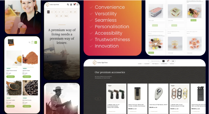
The Photography Problem Designers Can’t Fix
Design cannot rescue weak product imagery. This gets acknowledged in theory and ignored in practice, usually when the photography budget gets cut. Online customers are making purchasing decisions without being able to touch, try, or examine the product in person. Photography is doing that sensory work. A single flat product shot against a white background tells a fraction of the story. Multiple angles, scale references, lifestyle context, close-ups of texture or detail — these are the elements that reduce purchase hesitation in the way a well-lit retail environment does automatically. No amount of clever layout compensates for images that don’t answer the questions a customer is silently asking.
Checkout Friction Is A Design Failure
Cart abandonment at checkout has well-documented causes — shipping costs surfacing too late, forced account creation, too many form fields, limited payment options. Every single one of these is a design and UX decision that someone made, usually without testing it against real customer behaviour. Sydney ecommerce website design that addresses checkout properly surfaces shipping information early, offers guest checkout without friction, and supports the payment methods customers actually use. The people abandoning at checkout have already decided to buy. Losing them at that point is a structural failure, not a marketing one.
Seo Isn’t A Post-Launch Task
Technical SEO built into the design and development process is fundamentally different from SEO applied after a site goes live. URL architecture, crawlability, page speed, structured data for products — these decisions made during build are expensive and disruptive to undo later. Sydney businesses that treat search visibility as something to optimise once the site is running often find that the structural decisions made during development are the exact bottlenecks limiting their organic reach. Getting it right during the build costs the same effort as getting it wrong.
Rebuild Or Refresh — The Honest Answer
Not every underperforming ecommerce site needs starting from scratch. Sometimes the platform is sound, the catalogue structure is fine, and the problem is surface — an outdated visual language, a product page template that no longer fits how the range has grown, a checkout predating current payment expectations. A targeted refresh fixes these without the lead time of a full rebuild. The honest answer requires an actual audit of where customers are dropping off, not an assumption that new is better.
What Local Expertise Actually Changes
Working with a Sydney-based design team changes the practical dynamic in specific ways. Time zone alignment means feedback loops are faster. Local market familiarity means design decisions are tested against actual Sydney consumer behaviour rather than generalised assumptions. Ongoing support after launch happens in business hours, not overnight. These aren’t abstract advantages — they surface in the quality of communication during a build and in how quickly problems get resolved once the site is live.
Conclusion
The businesses selling consistently well online aren’t necessarily the ones with the largest budgets — they’re the ones that treated ecommerce website design in Sydney as a structural investment rather than a visual one. A well-built store earns its keep through better conversion, cleaner checkout, stronger search visibility, and a customer experience that brings people back. The design isn’t the end of the process. For a serious ecommerce business, it’s where the commercial logic of the whole operation either holds together or quietly falls apart.